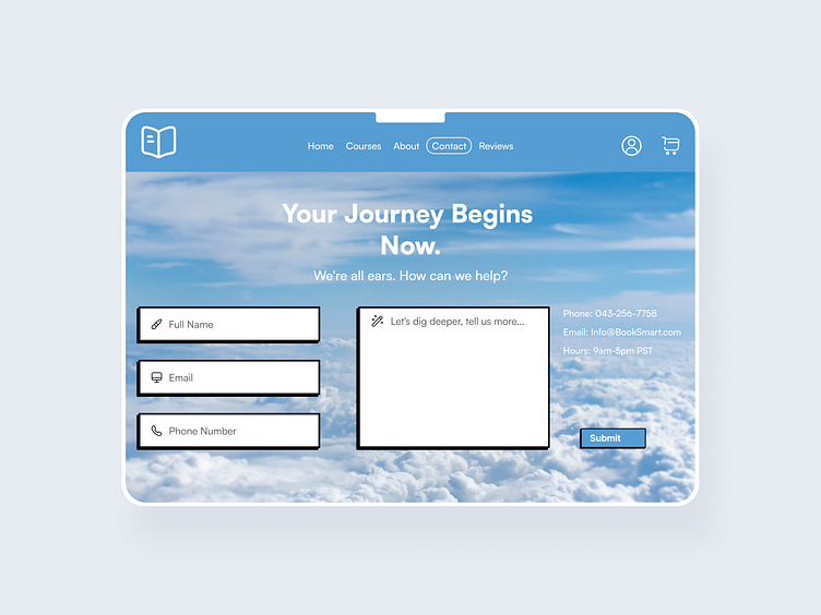
"Contact Page" Concept
Design Brief
Design a contact us page for a fictitious company. Consider why their customers might be reaching out and what forms of communication would meet their needs.
Research
Before beginning the actual design work, I began to research and understand why users visit a contact page and its essential role in a website's overall functionality.
Having conducted an in-depth investigation of contact pages, I identified several user pain points across different contexts.
These pain points include:
Confusing or unclear instructions on how to fill out the form or where to submit it.
Long and complex forms that require too much information, causing frustration or abandonment.
Technical glitches or errors that prevent the form from submitting or provide an unclear error message.
Lack of confirmation or acknowledgement of the form submission, causing uncertainty whether the message was sent or not.
Slow loading times or an unresponsive page that prevents the user from submitting the form.
Lack of alternative contact options, such as a phone number or email address.
No indication of expected response time or timeframe for a reply.
Poorly designed or hard-to-read Captcha tests that cause difficulty in completing the form.
Goal
My goal for this assignment was to create a contact page for a business that provided a calm and welcoming experience for the user.
User Persona
Creating a user persona allows me to dive into the users' minds I'm designing for. By understanding their aspirations, needs, and preferences, I can construct an application that resonates with them, resulting in a tailored user experience.
User Flow
I envisioned the app's user flow before commencing the design process. This process allows me to tailor my application precisely to the user's preferences, delivering a coherent and enjoyable user experience.
Wireframes
My process for creating visually compelling designs includes the use of wireframes. Opting for grayscale wireframes with minimal color application allows me to precisely shape the design’s visual identity and layout, avoiding color-related distractions early in the design process.
Visual Design
With my wireframes completed, I confidently moved onto the design phase, creating high-fidelity wireframes that integrate colors and brand identity, elevating the design's visual appeal.
Key Features
With a user-centric approach to my contact page, I carefully included:
Enabling users to provide multiple contact options as needed.
A dedicated space for long-form messages.
An informative confirmation message clarifying the expected response timeline.
Prototype
To enhance the page's user experience, I integrated animations, and interactive components, allowing me to explore the contact page's potential behavior and functionality once fully developed.
Conclusion
Throughout my research, I discovered that users highly value a direct and simple means of contacting companies. The significance of contact pages became evident as they serve as a pivotal link between users and brands. This connection strengthens the brand's relationship with its community and enhances a user's perception of the company.
Creating this contact page was a fun challenge, putting my design skills and critical thinking to the test. Looking deep into the user's perspective and understanding their unique needs was vital, ensuring that I crafted a comfortable and joyful experience while navigating the website.
Thank you for reading about my contact page!


