New York Cosmos Rebrand
One of North America’s most iconic sports teams, the New York Cosmos has been home to some of soccer’s all-time greats since its inaugural season in 1971. Players like Raul, Giorgio Chinaglia, Franz Beckenbauer, and Pelé have all donned the Cosmos jersey. While the team logo has been modified slightly over the years, Cosmos has never had a comprehensive overhaul of its visual identity.
In the past decade, the team faced a series of difficulties including changes in ownership, league changes, financial struggles, lawsuits, missed seasons, and a pandemic. The future of the team is uncertain.
Early in 2021, the team announced that they would be on an indefinite hiatus. With the pandemic starting to slow in the US, and sports beginning to operate at full capacity again, it’s not out of the question that we could see a return from the New York Cosmos in the near future. It’s the perfect time to clean the slate, refresh the brand, and reclaim the club’s long-standing prestigious reputation.
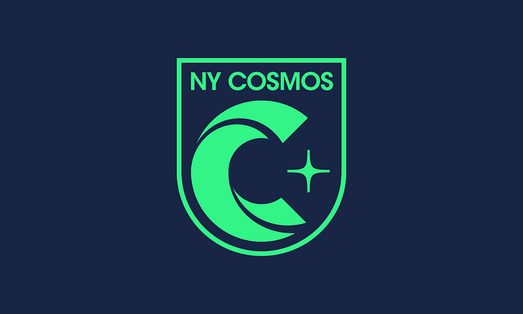
An updated crest symbolizes a new era in New York Cosmos history. Because of the team’s storied history, it’s important not to betray the legacy and vision of the original logo. The logo makes improvements to legibility, concept, and construction, but still feels thoroughly Cosmos.
Featuring striking minimal shirts with contrasting collars and cuffs, the New York Cosmos kits have a strong sense of visual tradition. The new home jerseys have adopted the green shirt, white accent arrangement that was previously used for the away kits, which provides a more energetic home field appearance.
The away kit has adopted a dark Cosmos blue, to create an imposing presence on away turf. This new look also maintains contrasting accents with a tastefully tipped collar and cuff combination.
Finally, the third kit embraces tradition in a different way and displays the new crest, as well as the three stripes on the cuffs and collar, in the original Cosmos colors of blue, yellow, and green.


