Unifying Communities: The Story Behind Briden's Empowering Logo
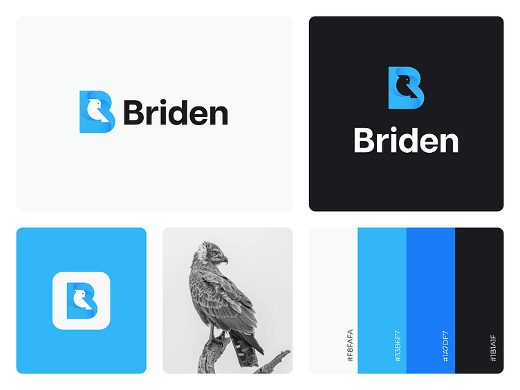
Briden is a social media platform designed to bring people from all walks of life together to connect and share their experiences. The logo represents the platform's vision of unity and freedom, embodied in the form of a bird. The bird shape is made up of a sleek and modern "B" letterform, representing Briden's commitment to innovation and cutting-edge technology.
The picton blue color used in the logo symbolizes the platform's calm and tranquil nature, while the black color provides a sense of strength and stability. Together, these colors and the bird shape suggest a place where people can feel safe, comfortable, and confident to express themselves freely and authentically.
The story behind the Briden logo is one of hope, empowerment, and inclusivity. It is a symbol of a community that embraces diversity and celebrates the unique qualities that each individual brings to the table. Through its innovative features and user-friendly design, Briden promises to provide a platform that encourages meaningful connections and fosters a sense of belonging among its users.
Looking for a fantastic design solution? Xodio has got you covered! Our expert team of designers specializes in a range of sectors, from logos to branding and more. Contact us today to elevate your brand with our top-notch design services.
Reach out via
Skype: +880 1642 695761
Whatsapp : +880 1642 695761
Check Our online Presence :)
⚡ Behance
Say Hello For a free discussion about your business problem.
⚡ Email: hello.xodio@gmail.com
✰ We do not provide only Visual, we provide value.✰
