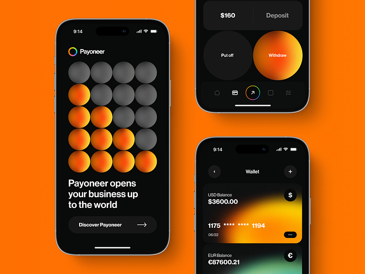
Mobile redesign concept for a FinTech app | Lazarev.
Good day, the Dribbble community 🕺
Get ready to elevate your payment game with Payoneer's new redesign by Lazarev.agency 💸
We took the challenge of redesigning the popular Fintech platform and the results are fresh, bold, and visually stunning.
Our approach for this app concept design was all about creating a striking contrast with vivid colors, gradients, and big round buttons that grab your attention. The dark background adds depth and makes the elements pop, while the unique font adds a touch of personality. We've also done a logo redesign, giving it a vibe of modernity while keeping simple yet impactful. And, of course, we ensured that the design is responsive and adaptive to mobile devices, providing seamless UX across all screens.
So, if you're looking to empower a Fintech platform and stand out in the crowded market, hit us up at hello@lazarev.agency And share your feedback on this redesign app concept. We’re all ears 👂

