Build 1.0 - Day 20 | Hotel booking checkout app
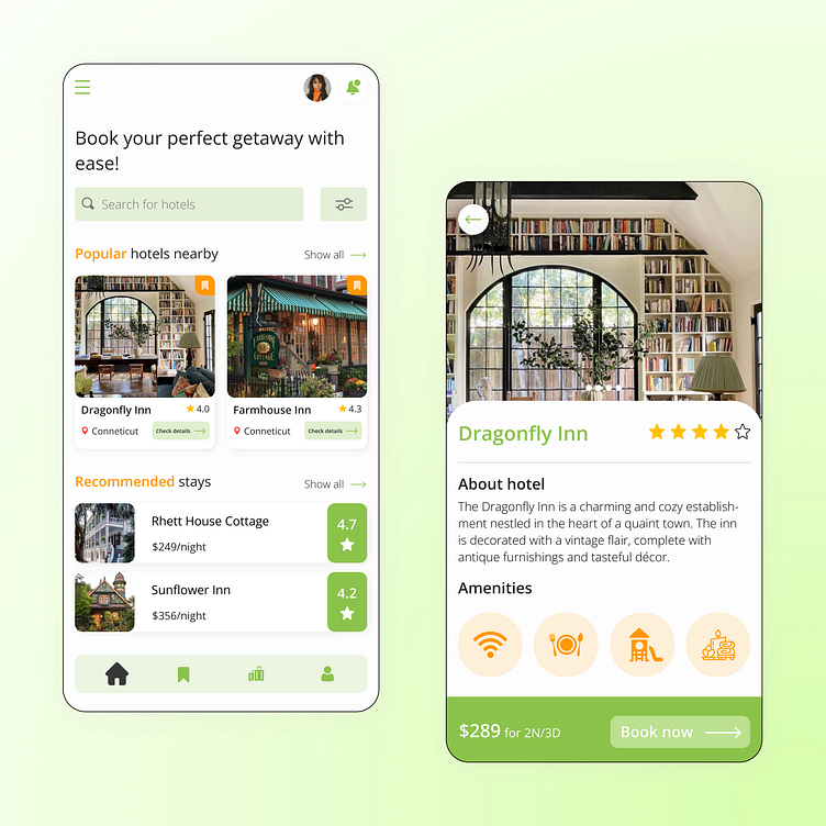
This is #Day20 and my challenge was to design a screen for a hotel booking checkout application. So, I decided to design two!
I know there could've been more than just two screens for a hotel booking application, but I tried to envision which screens would be frequently visited by the users of the app, and then came up with the two screens above.
I used the 4 point grid system for this screen, and all mobile application screens that I design will be made with the help of this grid system. It really helps you get the placing right and definitely helps with maintaining the visual hierarchy of the app.
More by Mansi Pandey View profile
Like
