Adium Reimagined Update 1
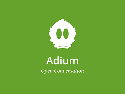
Worked on the branding peice. I changed out the colors and instead of the action bar being blue, it's now green. I also added the pink color as the accent. The color change was just trying to stick with a green like Adium currently has but add a good accent color. I also felt like the color pallet was extremely bland. I think the green and pink feel more modern. I also updated the logo. While it still looks like the original it's now symmetrical and cleaner. Check out the attachment to see the app shots.
More by David Poninski View profile
Like

