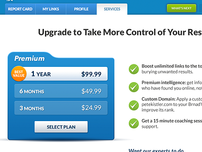
BrandYourself Upgrade Page: Version A
We're about to start A/B testing our upgrade page to better understand how our designs affect conversion rate to paid features.
• VERSION A: this shot
• VERSION B: https://dribbble.com/shots/2100757-BrandYourself-Upgrade-Page-Version-B
This version shows a plan selector on the left, with the benefits strongly emphasized on the right. Version B shows a credit card in put form on the left, with the benefits slightly de-emphasized on the right (to avoid competing with the busyness of the form).
Which one do you think will convert more people to Premium? I'd love to hear what you think! Once the results are in, I'll post them here.
More by Pete Kistler (BrandYourself.com) View profile
Like

