Case Study - Logging Feedback
The primary value add for the Mentoring Works app was to help organizations gather feedback from mentors and mentees following their meetings and interactions. Launching Mentoring Works as a separate app allowed us the opportunity to reassess the UX for logging feedback, and clean up the pathway to be more simple to successfully navigate.
My early design process generally maintains the following criteria:
Initially, try to roll out a minimum-viable-solution and keep scope as limited as possible, while still doing enough to address the pain points/areas of high friction. (Which is to say, try and keep the budget for the project low.)
Don't move the cheese - If existing users are accustomed to a particular pathway, disrupting it could cause more harm than benefit.
Ensure the solution is not hyper-specific to the pain point, and explore designs that might provide unforeseen value adds elsewhere.
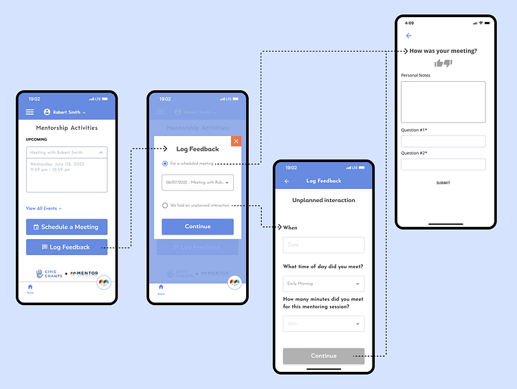
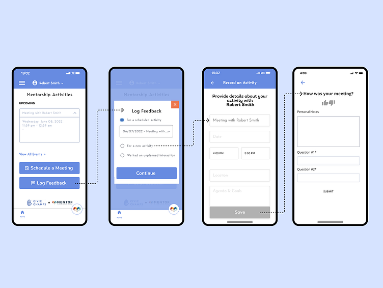
This resulted in the change to the Log Feedback modal shown above: a third radio option to log feedback for a meeting that had not yet been scheduled. I also changed the scheduling language from "meeting" to "activity" to more clearly indicate this was the correct place to schedule any planned interaction.
While the added solution succeed in being affordable (it simply sandwiched existing activity-creation UI between the Log Feedback modal and Record Feedback page) and not moving anybody's cheese, I was not pleased with the resulting complexity of the UX. New activities and unplanned interactions had unnecessary redundancy, and the entire system was becoming too sprawling relative to how simple of a function it was performing.
Redesigned Pathway
Implementing Mentoring Works as a standalone app provided the opportunity to more holistically address the user flow for logging feedback.
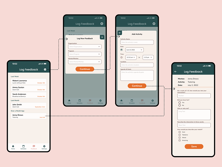
The first addition was dedicating an entire screen to logging Feedback (shown above). A page of past activities that still required feedback was more easy to navigate than a dropdown, and allowed for more space to be spent on identifying information (match name, event name, and date) so that users could more easily select the correct activity. This also lowered the risk of users incorrectly thinking their activity had not been scheduled (they can't find it in the list), and then creating a duplicate activity in order to log their feedback.
However, because the Feedback page was not match specific, and had to accommodate showing past activities from multiple programs and matches, the Log New Feedback UX was a bit complex, requiring users to first define the organization, program, and match before they could create the unscheduled activity. This consideration resulted in the addition of the pathway below.
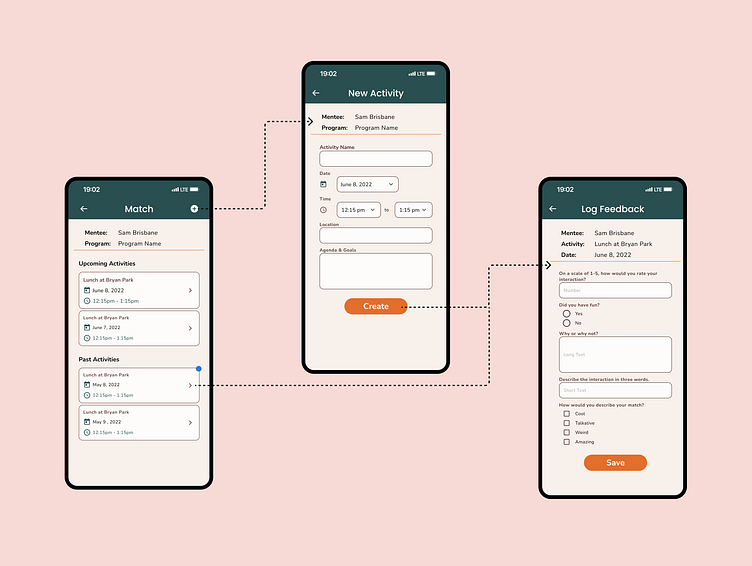
Because the new app now had a dedicated Match page, which showed all upcoming and past activities a mentor/mentee had with a particular match of theirs, I figured this would be a good place to mirror the Add Feedback UI, with the advantage that now contextual information (organization, program, match) was already known from this starting point. This means that logging feedback for unscheduled activities from this point could be more streamlined and less burdensome.
Additionally, this page also serves as a log of all past activities (including ones that already have feedback logged). For that reason, graphical indicators were added to activities that still required feedback, so that users could more quickly identify them.
