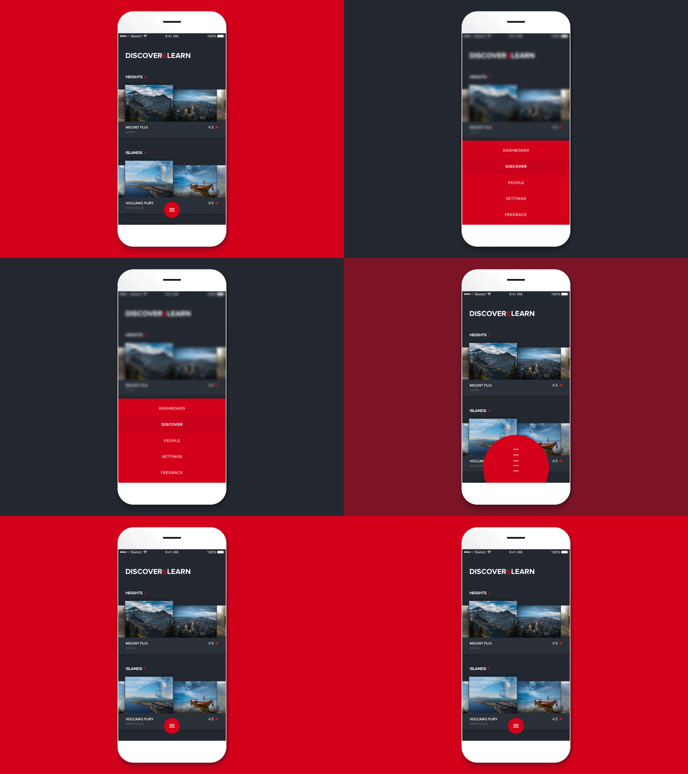
Navigation at the bottom
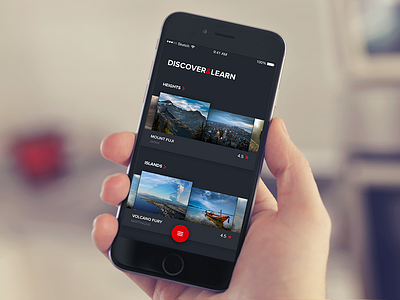
A quick exploration of navigation at the bottom to fight against finger stretching on large devices. What do you guys think?
I have the feeling that some phones, and phablets are devices where you are likely to use 2 hands: To what extent should we think about this?
I would like to see some articles about that, to see if there is really an impact on the user and engagement, etc...
Hope you like it! Press "L" on your keyboard if you do, and "F" if you don't want to miss my upcoming work.
Have an exciting week-end,
More by Aurélien Salomon UX ➔ View profile
Like


