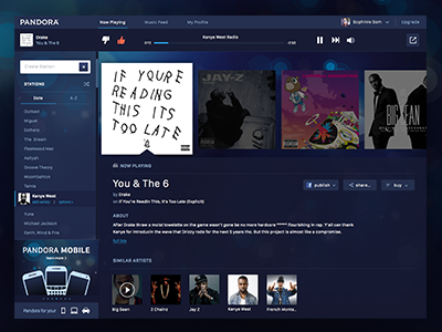
Pandora Redesign
Instead of putting more time into the aesthetics, I concentrated more on having an easy user experience... which ended up being a lot harder than I thought to lay out. After many failed wireframes and crumpled paper balls, I think I nailed it. I also attached their current site for comparison. I plan on making a lighter version, but decided to make this one dark while sticking with the current branding/colors.
Feedback appreciated!
More by Sophinie 🍵 View profile
Like


