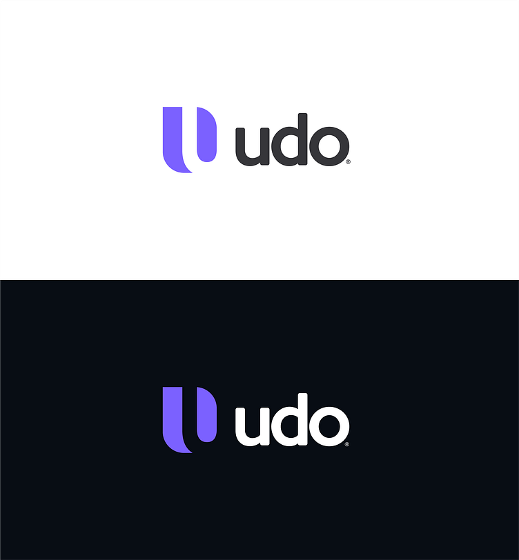
Udo Logo
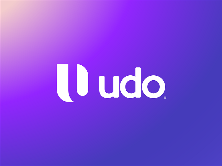
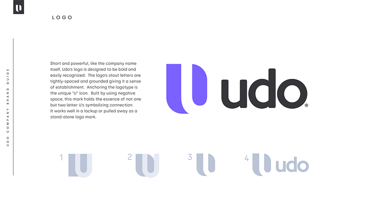
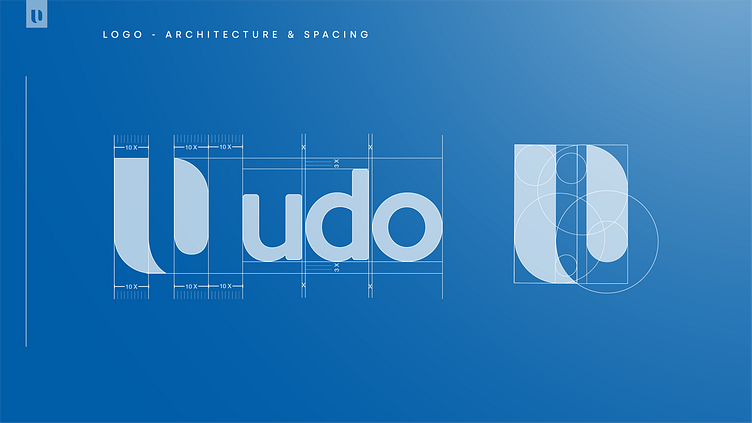
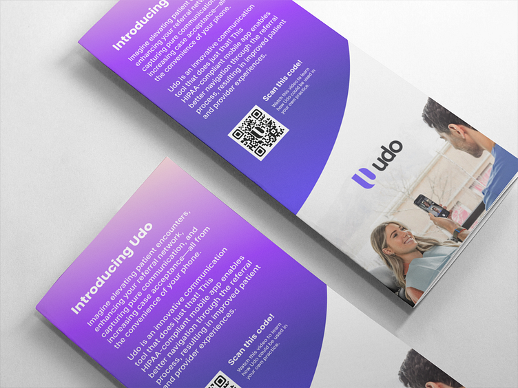
This Health Tech startup company needed a simple, smart, and bold logo to accommodate its simple name. Short and powerful, like the company name itself, Udo’s logo is designed to be bold and easily recognized. The logo’s stout letters are tightly-spaced and grounded giving it a sense of establishment. Anchoring the logotype is the unique “U” icon. Built by using negative space, this mark holds the essence of not one but two letter U’s symbolizing connection.
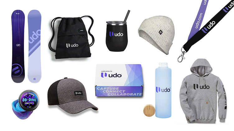
It works well in a lockup or pulled away as a stand-alone logo mark.