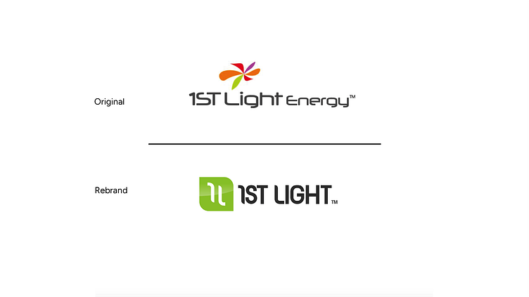
1st Light Energy Logo
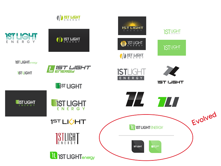
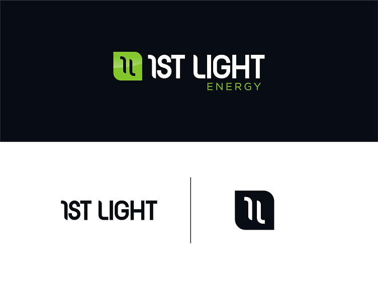
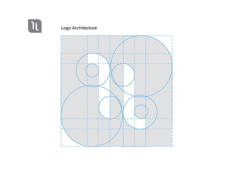
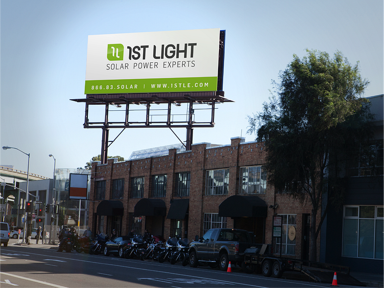
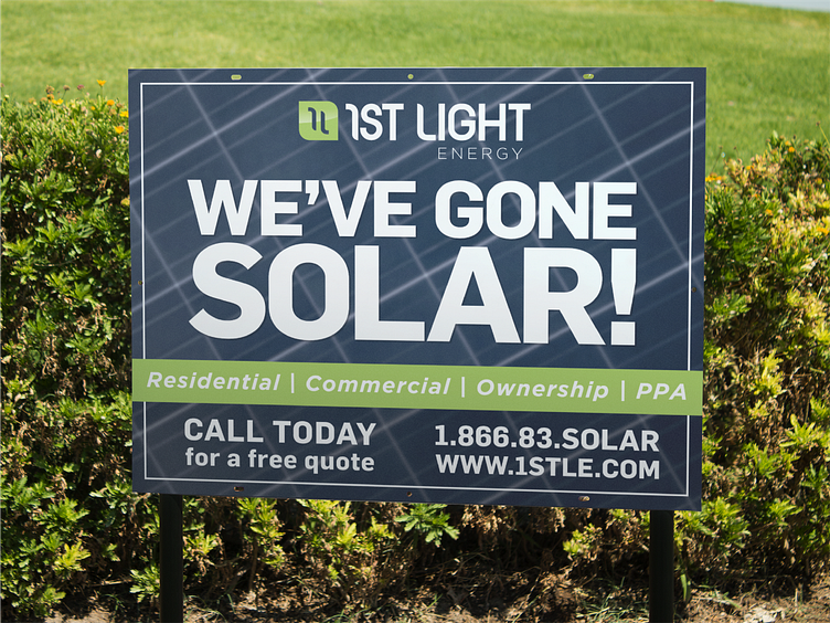
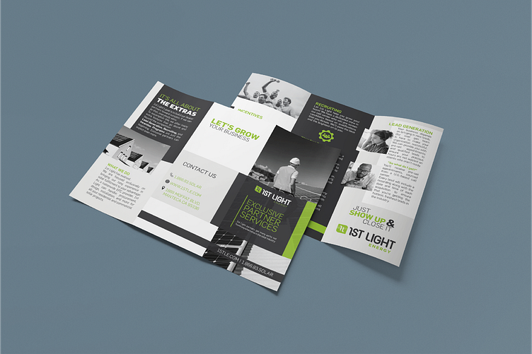
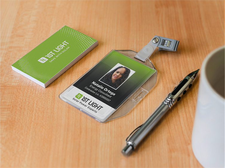
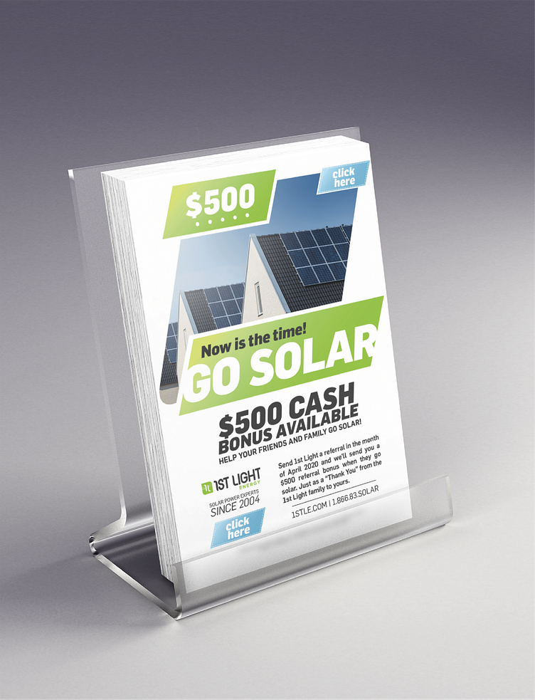
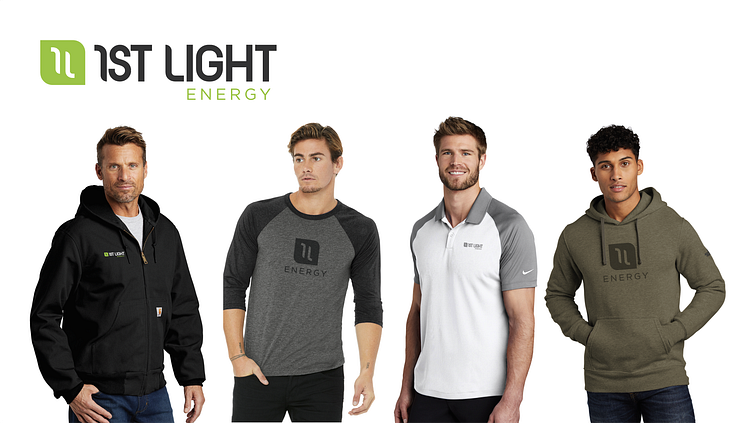
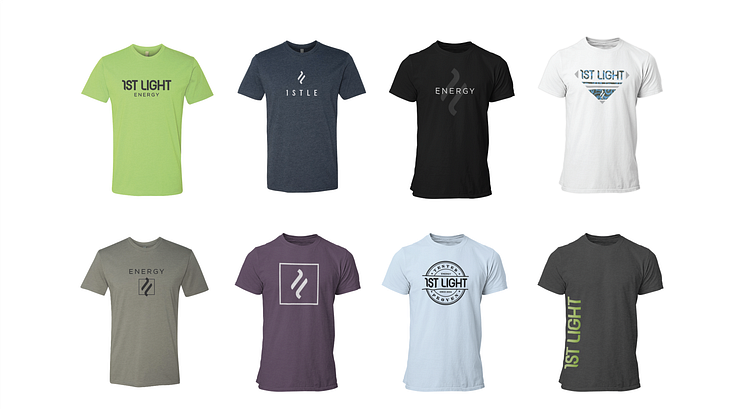
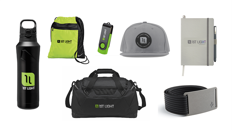
The Client was a successful Solar company, 1st Light Energy (out of Manteca California) who came with a request for a full rebrand and new marketing assets. As seen below, the logo and branding elements were updated with a cleaner more unified logo and typeface. The color pallet was simplifies to two main colors. And the logo mark was morphed into a leaf shape encasing the "1 L" for 1st Light.