Resto.ch (Branding, Mobile UX/UI 2022)
Resto.ch is a Switzerland restaurant directory, with job board functionality.
The old branding and website are dated and have multiple problem. This project is aim to establish a more professional brand, improve their mobile website UX (User experience) and UI (User Interface)
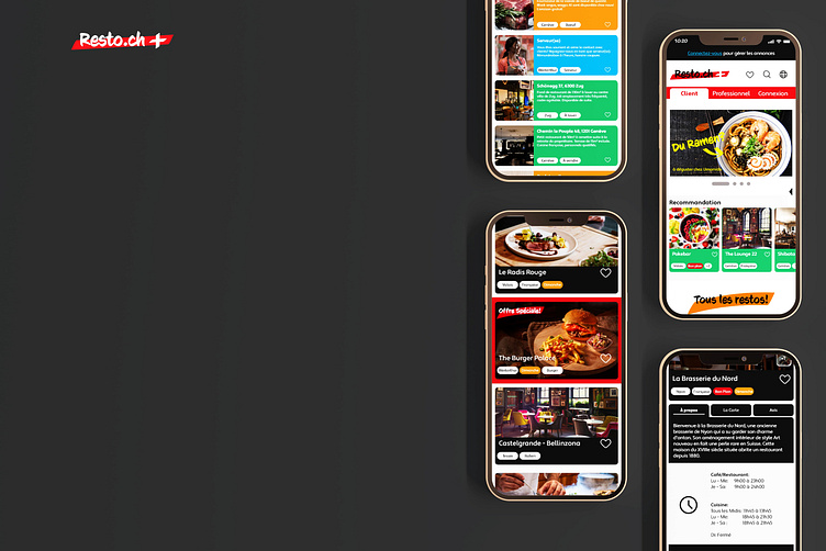
The final result
The process
The old branding consist of only a logo, without any other graphical elements. The logo itself is dated, without any concept and the typography chosen isn't representative of the brand sprit.
The process is below:
1 - Analyse competitors
2 - Establish brand strategy
3 - Creating a strong concept according to brand strategy
4 - Making the logo and brand's applications
5 - Analyse current website, client's needs and target audience's needs
6 - Establish personas
7 - Taxonomie
8 - Userflow
9 - Website mockup in low fidelity in Adobe XD
10 - Website prototype in Adobe XD
The brand concept
I was inspired by the old way of searching the phone book: with a high-ligher going through the list. I want to bring this nostalgia to the old generation and to spark the younger generation's curiostity.
The typo face chosen is CCSignLanguage developed by Comicraft. It has a wide, bold and rounded strokes similar to high-lighter stroke.
The Swiss flag in negative space is a wink to the old logo.
The Website
The old website present multiple problems, notably on visual presentation and information architecture.
I established 3 personas to represent 3 types of target audience of the website.
1 - Those who look for restaurant to dine
2 - Professionals who look to recruit, sell/rent their restaurant, or to find the list of suppliers.
3 - Suppliers who want to advertise their services or products
The information architecture and User flow are based on the 3 personas
Low fidelity mock up to explore block positions and functionalities.
Final prototype
Functional prototype
Thank for reading !
I am reachable at N.NguyenGE@gmail.com for any inquiry.


