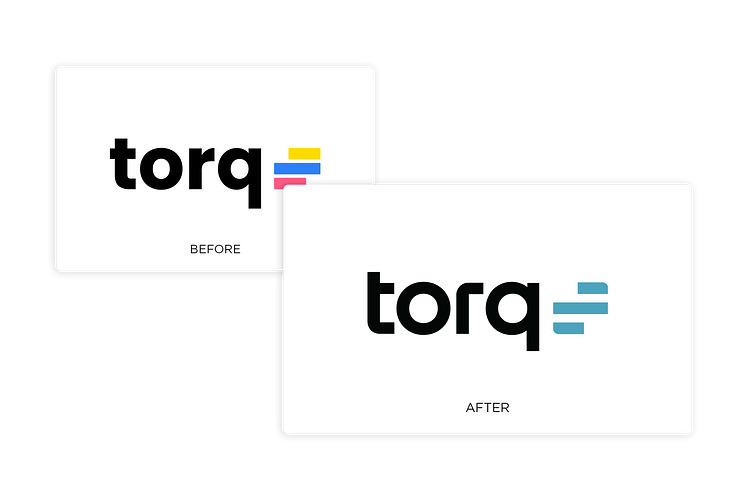
Modernize Torq’s Visual Identity
Project Goals
This project aimed to evolve the visual identity of a modern, scalable security automation company and develop a style guide to ensure consistent use of branding elements.
The Final Deliverable
I collaborated with TurnStyle Studio to design a new Torq logo and brand system. We evolved the type from Poppins to a custom typeface for the logo name. We also narrowed the multiple colors in the mark to one teal color, enabling more substantial brand recognition.
To ensure the longevity of the brand system, the team developed a brand book and implemented a searchable web portal. The web portal allows the brand system to scale and remain accessible as the company grows.
On launch day, the team changed the logo across the company in 48 hours. Over the next eight months, Torq saw 800% revenue growth and 10x customer growth.

