Goin' back to school on this one


I've been tasked with redesigning a local foundation's logo. This is one of the toughest logo projects I've ever worked on because the concept behind this and most foundations is so abstract.
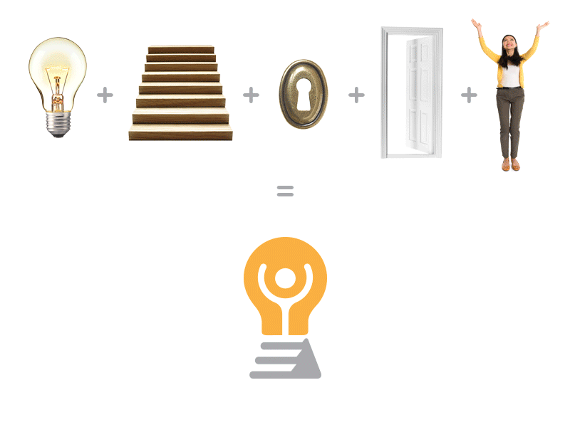
Basically, the foundation gives grants to local entrepreneurs. The idea behind this logo is “We help people with good ideas (lightbulb) work (stairs) toward their goals (cheering person) and open doors (keyhole) that they could’ve never opened on their own because of lack of funding.”
I went back to my college days on this one studying the mid century greats for visual inspiration. I want this mark to be simple, clean, readable and timeless.
Long explanation I know! Thoughts?