(2020) UX Audit - Case Study
My Role:
Product Designer
Task:
Perform UX audit on current checkout flow.
Outcomes:
UX audit report and change strategy.
The client is the huge European e-commerce seller of building materials & tools, who is launching their new delivery option — the delivery within few hours. But the checkout segment wasn't working as it should, so they requested the UX audit, and potential solutions.
The very first thing I've done was a 10 Usability Heuristics Check.
12 UX Issues:
7 - Severe
5 - Minor
At the same time something weren't ok with the new feature itself. After few interviews, info gathering, I decided to start for the beginning and think through the whole flow.
Proto-Personas:
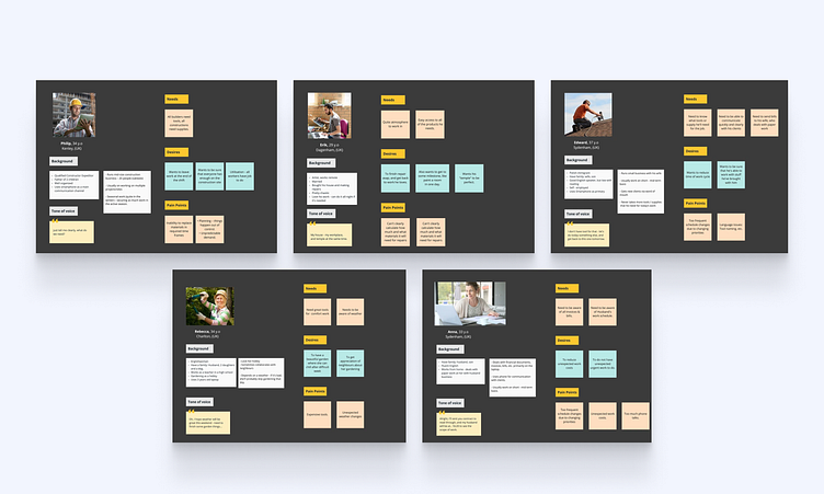
It's obvious that our personas are specialists & homeowners, what is useful — the cases in which new delivery option will help. It appeared that there are more potential customers, like self-employed fixers and their family members, gardeners etc. — additional personas.
Next step — Customer Journey Maps:
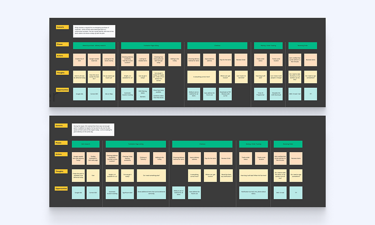
Personas experience mapped down revealed the fact that the main problem with checkout is defocus of customer's attention and lack of information about new feature. For Additional personas, the issue was builder's industry jargon and lack of clarity in checkout flow.
To see how the client's competitors deals with such issues, and how overall service experience differs, I made a competitor's benchmark:
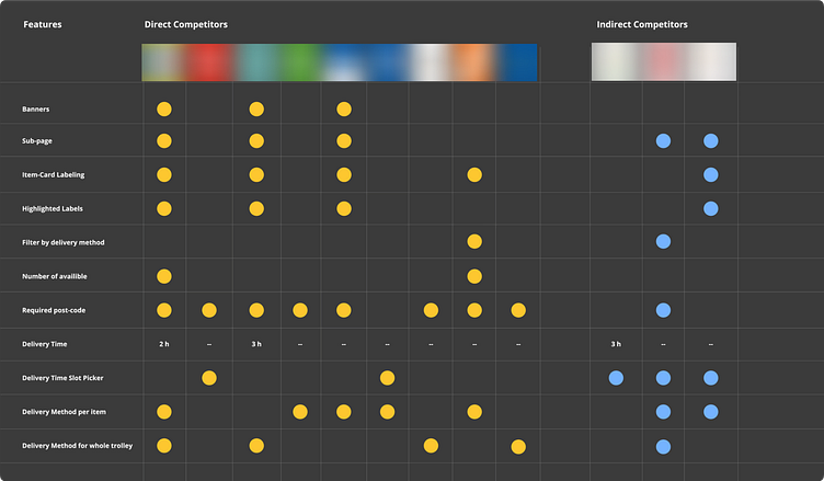
Benchmark revealed that client's services missing few crucial features with significant impact of customer's satisfaction like:
Delivery time picking
Filtering & sorting by delivery method
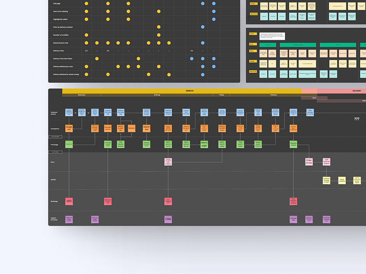
As well as features, some direct competitors showed higher level of usability quality. To summarize all findings, I created a Service Blueprint with all issues marked down and annotation with potential solution:
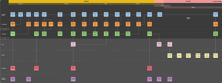
Even on this stage, I continued to catch issues.
The major and the most important one — absence of communication with customer in the period after the purchase and till the physical delivery by vendor company. The minor — lack of awareness of the new feature, can be covered with advertisement on the web-page and as car surface stickers. In short, to improve the experience service requires:
Overall UX revision and UI rework of checkout to provide clarity of steps
Reduce or explain industry jargon
Implement notification system to keep customer informed about delivery status.
All the outcomes were wrapped into keynote, and sent to the client, and after review discussed on a meeting with stakeholders.
.
Press F / L to pay respect.
.
Follow me on Instagram, LinkedIn
.
Have a nice day ✨
