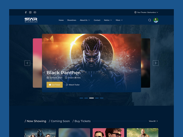
Star Cineplex - Home Page Redesign
Hey Guys!
Super excited. Today I am sharing with you the concept of Star Cineplex Home Page Redesign. I aimed to create a visually striking representation of the Movie Theater Ticket Booking Website’s Home Page, focusing on user experience, maximizing aesthetics and visual impact.
Main Home Page of Star Cineplex
Problems
👉 Design is messy
👉 Visitors find it difficult to navigate through the website
👉 Current designs lack of trust or attract new customers
👉 The design looks outdated
My goal is to improve the overall user experience of the website and the objectives are...
Design Fundamentals:
✅ Hierarchy
✅ Color
✅ Type
✅ Layout
✅ Content
✅ Overall Aesthetics
Important Webpage Elements:
✅ Messaging
✅ Visualization
✅ Effective CTA’s
👉 High Fidelity Wireframe 👈
👉 Style Guide 👈
👉 Redesigned Home Page of Star Cineplex 👈
👉 Explanation 🔥
🔥 Visual Presentation 🔥
Let me know your thoughts on that. Your feedback and appreciation are always welcome. 😊
Have any project? Let's talk about it.
Email: muminulhoqchy@gmail.com


