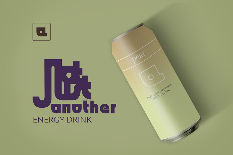
not JUST another
Not just another energy drink but a healthy one!
I had fun trying out different styles with the logo I created. The logo is a combination of the letters n, j, a. I found inspiration in the design trends of 2023 such as using serif, blurs and gradients as well as some color trends of this year. I made one more simple and elegant mock up and one more playful.
In one example of the logo I also used the pantone color of the year - Viva Magenta 18-1750
Fonts used:
I edited the font Bauhaus 93 to make the logo
Serif: Bell MT
CAPS: Roboto
Mock ups:
More by Amanda View profile
Like


