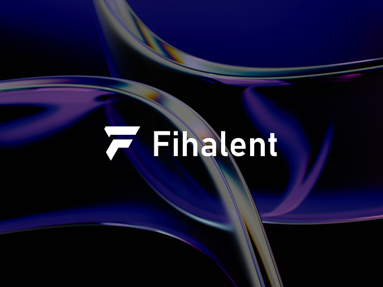
Fihalent - Brand Identity Guidelines
Hello Everyone!
I'm excited to share with you the brand identity guidelines I created for Fihalent, a concept tech brand that's all about simplifying complex tasks with innovative solutions. Our brand is driven to achieve excellence and always pushing ourselves to create cutting-edge solutions while being approachable and collaborative.
An effective logo and brand guidelines are important elements in building a strong and easily identifiable corporate image. Through logos, companies can be easily recognized and remembered by customers and other stakeholders.
Therefore, on this occasion, I would like to share the results of this minimalist, clean, and professional exploration of the logo design and brand guidelines that I created.
Check out the full project below 👇
Logo
Our logo features a clean and modern design that incorporates the letter "F" because we wanted to use the letter f that we had in the brand name as a point. The logo is versatile and can be used in different color combinations to suit different applications. These were the things we wanted to convey in the message of the logo.
Color Palette
We chose a color palette that reflects our brand's innovative and reliable nature. The primary color is a deep blue that symbolizes trust, stability, and intelligence. We also have a secondary color palette that complements the primary color and adds versatility to our brand.
Visuals
Our brand visuals feature clean and modern abstract shapes, reflecting our brand's focus on simplicity and innovation. We use bold imagery and graphics to highlight our brand's solutions and features, and we also incorporate illustrations to add a human touch to our technology-driven brand.
Thank you for scrolling
I hope you will like the project ! If you like my design, please don't forget to press 'LIKE' button and if possible give your valuable 'COMMENT'.
Fihalent
Brand identity.
2023 @ All rights reserved.


