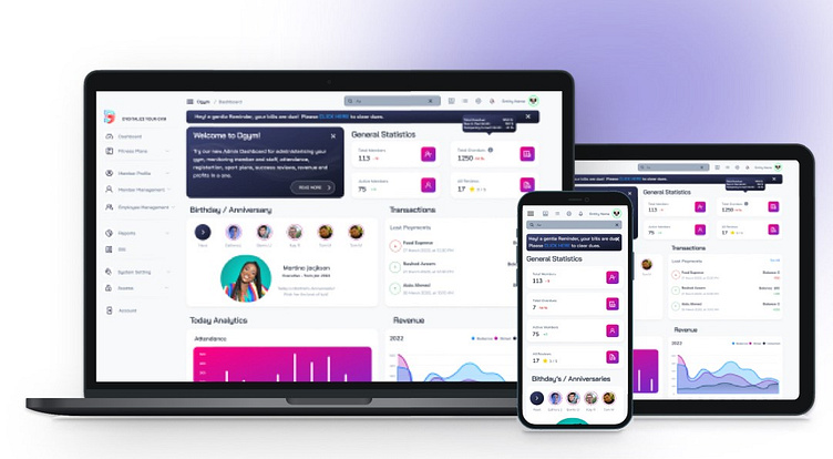
Dgym Platform Design
Dgym.in (Indian Software Development Company, owning a Sport Club Supervision Platform + Medical Web-Application)
Problem:
Dgym needed an attractive interface to can grow their revenues by spreading beyond India. They have active members currently and wanted me to re-vamp the whole product. In practice, it turned out that Current interface have more issues about user flow, site map, color harmony, white spaces, data visualization, Card designs, widgets, notification, NavBar, menus, alarm messages, etc. to be solved.
Client Wants:
We had some demo to understand the whole of product. Closely working with the developer and the Project manager, I was responsible to keep the main product functions and info., however I showed my creativity in some pages. The PWA design had to be modern, fully responsive, yet informative. To save time, Finally we made this decision to work on a Bootstrap UI Kit and customize it. It decreased my creativity in some cases, but was a proper decision totally.
Status: Developed by Client
Dashboard design
It’s of importance because it’s the first internal page the customers see, so must be attractive, informative, and summarized as much as possible.
I changed dashboard a lot, most importantly, moved most of the biz reports to a separate report page. Moreover, the NavBar, the quick access icons
Transaction list, member Remarks and the welcome message card are added by my suggestion.
Hire me for your ui/ux deign projects
nemati.azam.id@gmail.com

