Seamless Recovery MedSpa
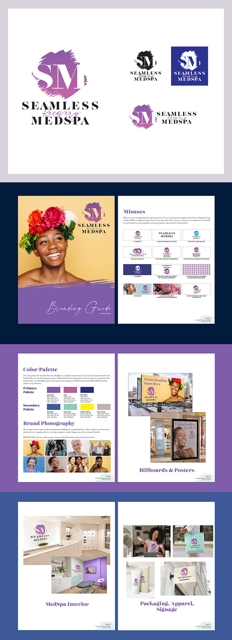
One of my favorite things I get to do as a graphic designer is to develop a new brand from scratch for someone who is following their dream by starting their own business. Such was the case with the team at Seamless Recovery MedSpa. Their enthusiasm and passion for what they do inspired and invigorated me to help them create a new logo and full brand package for their new business. When we first talked about their logo, we looked at a lot of the competition and what other MedSpas were doing. We quickly came up with the mantra: "NO LOTUSES." They were EVERYWHERE in the logos we found for existing medspas. One of the brand differentiators for Seamless Recovery MedSpa is their focus on the recovery aspect. Due to that, we played around with the idea of brush marks revealing something underneath—in this case, the monogram "SM." Once we settled on the main logo design, we set up variations of that logo including: a solid black version, a solid white version, and a version that displays the elements horizontally. We followed up the logo design by creating a full branding guide that can be used by the Seamless Recovery MedSpa team to guide them and keep the brand consistent as they grow. In this guide, we show how to use the logo and how to NOT use the logo. We illustrate the types of photography that the brand should use as well as the official color palette. We also created examples of what different types of advertising might look like including print ads, billboards, posters and social media. For this business, it was also important to think through how the brand would be expressed in real space, so we worked on exterior and interior graphics for their office locations as well as packaging, signage and apparel. With this guide, Seamless Recover MedSpa has a very well-thought-out, professional looking brand that will guide them and help them as they build their new business and grow in the years ahead.
