June Branding
The New June Logo
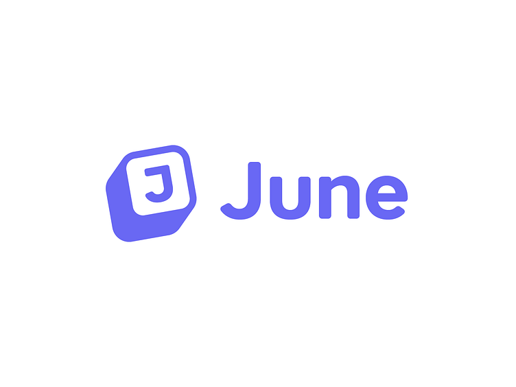
I had the pleasure to work with the amazing June team on a new logo for their product analytics tool that creates auto-generated reports based on company metrics.
Because they were growing they were looking to refresh their logo with something more professional and clean while retaining their warm and friendly feel.
Exploring Through Sketching
The previous logo was based on blocks/cubes similar to the ones kids play with. A nice metaphor for giving the users the building blocks to be creative and get what they want out of the product.
For the new logo they were looking for something immediately recognisable, easily readable, and suitable for simple usage in marketing materials. One of the challenges of the old one was that it was hard to read and not easy to use on avatars.
I went through the process of creating four pages of sketches, two of which can be seen here. Sketching is a great way of quickly generating and fleshing out many different ideas.
The Old vs. The New
I created dozens of logo concepts and I looked at hundreds of fonts. Check out this blogpost to see a few of them. After spending enough time exploring our options we landed on this version.
The new version still retains the spirit of the original logo, but it's recognisable, effortless to read, and easy to use.
The Details
In the original sketch the J was a lot more rigid and I tried to form it using the grid above but the result just felt unnatural. It just did not look right.
I solved it by using the wordmark typeface and customised the J to get something that looked right. Then I added a bar at the top to make it distinct from the same letter in the company name.
And why did I slightly rotate the symbol? Simply to make the whole thing look less stiff and more playful.
The Other Bits
I paired the symbol with Core Sans AR, a nice rounded typeface that just looked nice together.
The symbol on a dark background has an outline because that way the inside of the shape is aways darker, same as with the logo on white. This makes the logo pop and keeps it consistent.
Thanks for reading 🥰
Here's a gif of the logo to wrap things up. I hope you found this casestudy informative.
Let me know what you think in the comments.


