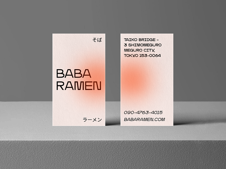
Baba Ramen Business Card
Project created for Boba Ramen, a new Tokyo-based restaurant in a busy commercial area. The owner requested business cards that would reflect the restaurant's brand and style, while also attracting new customers.
Goals
The client wanted the business cards to:
Represent the restaurant's brand and style
Include important information such as the restaurant's name, address, phone number, and website
Attract new customers to the restaurant
Stand out from other restaurants in the area
Process
I began the project by researching the restaurant's brand and style as well as the market. I studied their logo, menu, and interior design to get a sense of the restaurant's aesthetic. I also researched other Japanese restaurants in the area to see what kind of business cards they were using.
Based on my research, I developed several design concepts for the business cards. The chosen design didn't feature a bowl of ramen as most competitors do. Instead, I ended with a minimalistic approach and accents on typography.
To make the design stand out, I used bold typography and light orangey colors combined with blur effects. The bold typography added visual interest and made the important information stand out.
Results
The Boba Ramen business card project demonstrates how thoughtful design choices help a business stand out in a crowded market. By using bold typography and light orangey colors, I was able to create a design that effectively represented the restaurant's brand and style while also attracting new customers.
