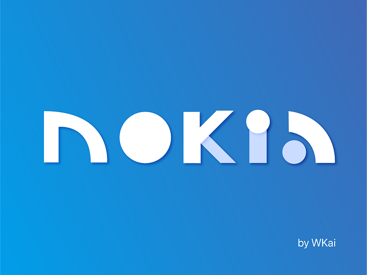
Nokia logo redesign.
Hi Dribbblers!
This is my take on modernising the Nokia logo. It has a neumorphic design scheme, with subtle shadows. All letters are in small caps, giving it a more friendly, less utilitarian feel.
My design stages
The above is my design process, from sketching to stylising my icon.
Thanks for viewing!
If you liked my work, please ❤️ or press 'L' 😊. Comments are welcome too :)
More by Teo Wen Kai View profile
Like


