Fonts.com Banner Daytona
Start your eng… oh wait wrong sport.
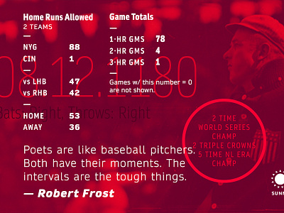
This is banner #3 for me for fonts.com, and I'm really pleased with how this one turned out. I was told that Daytona was originally conceived for sports broadcasting, so of course I had to do something baseball related. Check out the banner on their site here and learn more about Daytona here.
I was really pleased with how the font worked across all its weights and sizes. It's a good combo of tech and friendliness.
More by Bethany Heck View profile
Like

