Branding and Packing for oRegion
Branding and Packing for oRegion by Cohesiv.co
The Story
At an early stage, co-Founders – Rajat and Mayank reached out to Cohesiv with an idea to help the farmers and food producers of the underdog regions of India. As they both cherish their roots, we could sense a genuine feeling of responsibility they had for their homeland. The project developed into a social enterprise that aims to make regional-original foods accessible and in return help rural farmers and producers by giving them a market and a fair value.
oRegion celebrates the stories about the joy of getting the best out of nature and health for everyday consumers. The good folks at oRegion have collaborated with natural farmers and agricultural producers from culturally diverse & unexplored regions in India.
The Process
While designing the identity, we came up with the name oRegion which signifies the origin (of food coming from floral species) with original characteristics, committed to delivering regional produce to the masses. The challenge was to make the brand look familiar and comfortable for the target audience of tier 2-3 cities as well as attractive for the tier 1 target audience of India.
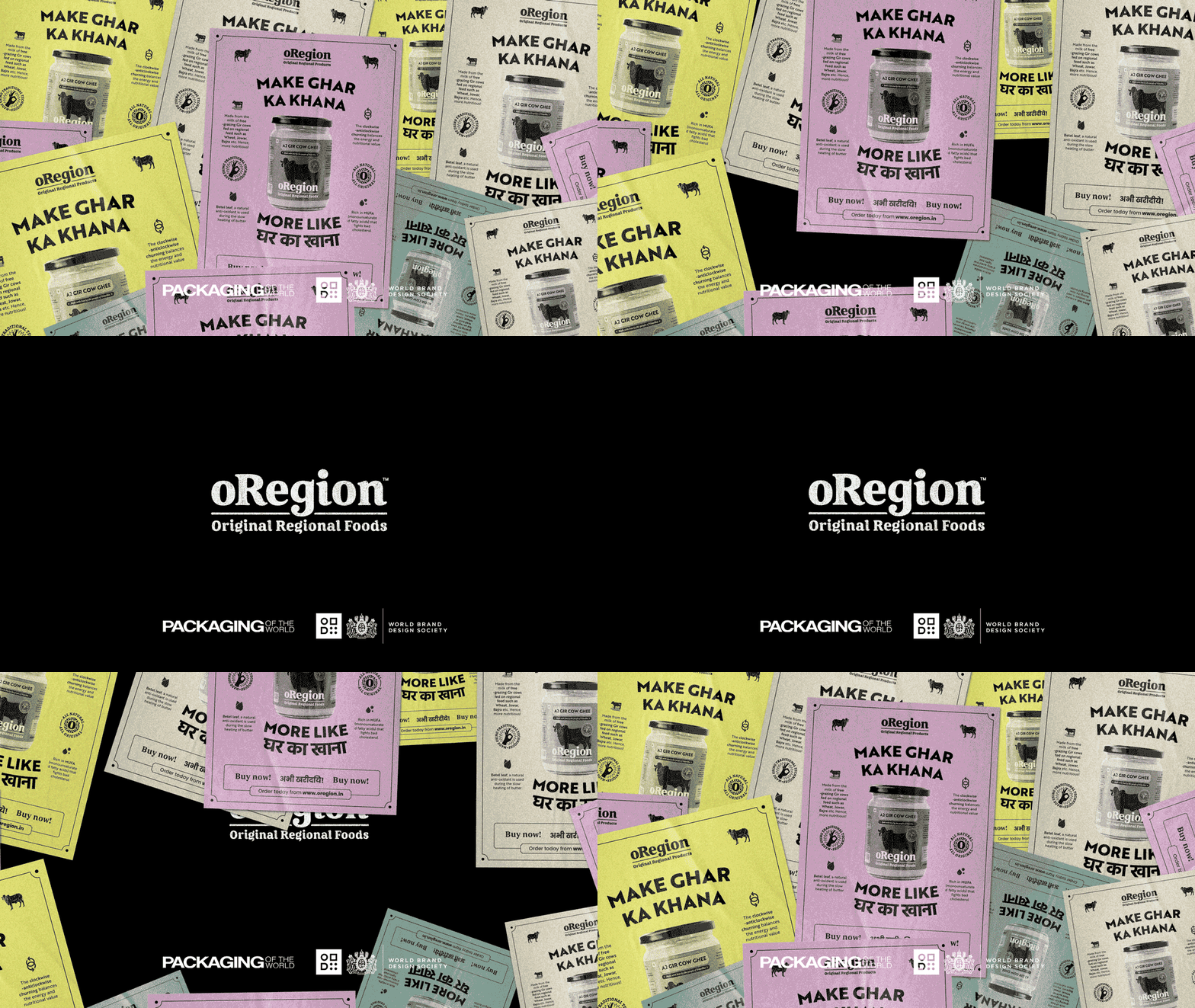
The solution was to create a design system that is inspired by the local/regional graphics such as brightly coloured leaflets and give it a modern flair. The result was uncompromising and won a lot of hearts of the people of Vidarbha. This is was the story of going back to their region. Back to their origin.


