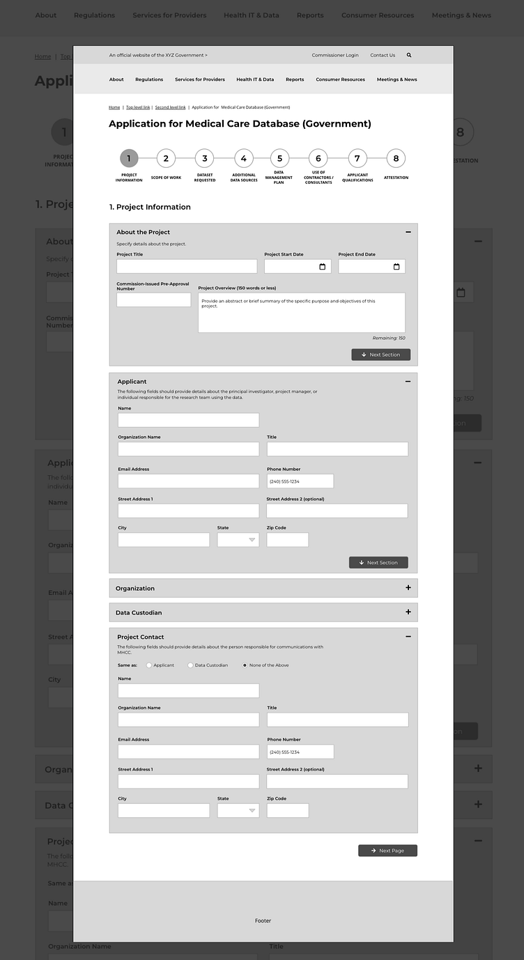
Complex multi-step webform
This low-fidelity representation of a webform reflects various usability and accessibility considerations. Problems that needed to be solved, in the redesign of this webform, included:
helping the user know which page of the form they are on and how many remain
reflecting complexity within a single page, with multiple sections per page, and the associated navigation within
form field best practices for speed, efficiency, and clarity by the user, reflecting insights relating to field grouping and eye tracking
User efficiencies were achieved through analysis that showed the requirements of this form involve the user having to specify name and contact information for various roles involved in the request, and the opportunity to programmatically autopopulate contact fields if the user indicates they are the same as previously-entered information.
This design anticipates navigation within the page, with the use of the 'next section' buttons, and associated icons that help the user know where they are navigating. It also supports the user to minimize their cognitive load by collapsing sections of the page.
This page would be preceded by a welcome and introduction page, informing the user what information they need to have available to complete the form and the amount of time expected to complete the form. (Completed as part of a paid project with GovWebworks.)
