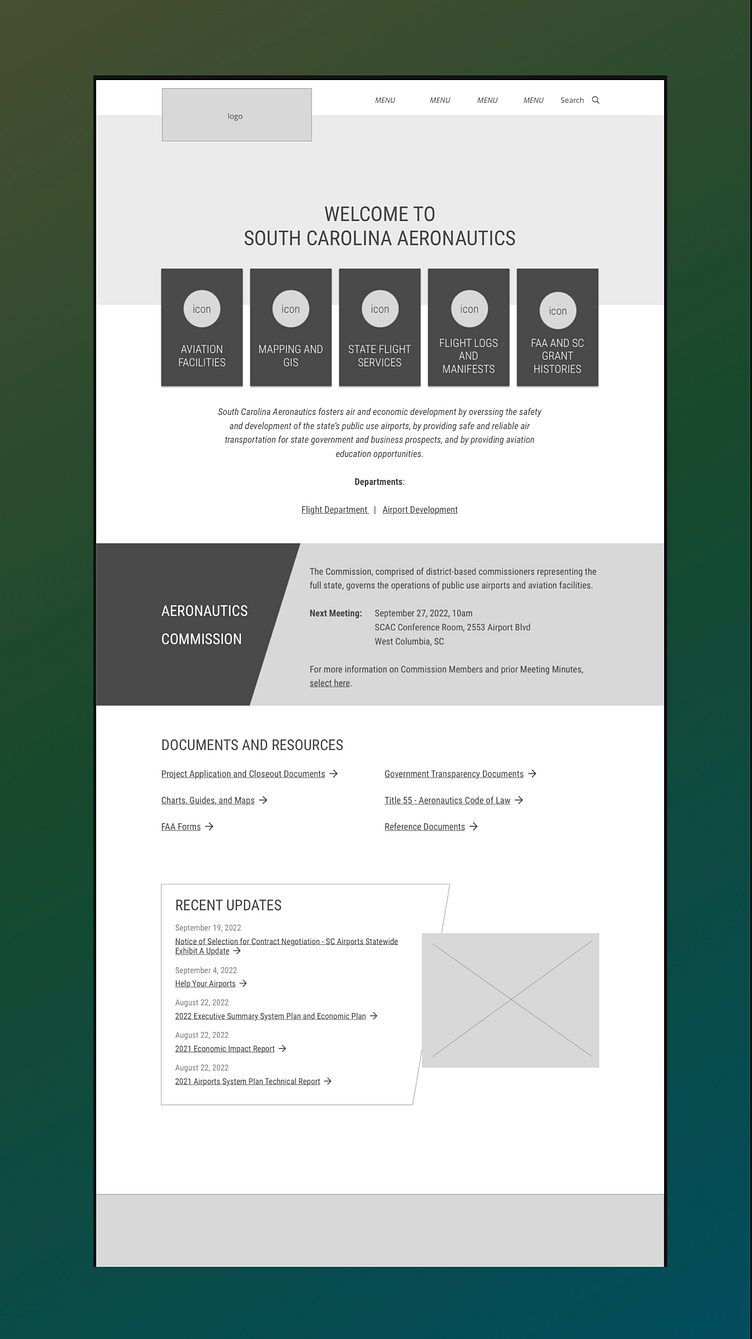
Simple Aeronautics Homepage
Done speculatively for consideration by a state aeronautics commission, this homepage design strives to bring transparency to the user as to the purpose and role of this organization within the state, its mission, and its areas of responsibility. While low-fidelity indeed, visual elements of layering, geometric angles intersecting with right angles and hard edges, as well as a tall and linear font face, were chosen to take inspiration from the shapes and lines associated with aircraft and the associated infrastructure and facilities. (Done as part of paid work for GovWebworks.)
More by Sarah Crossman View profile
Like
