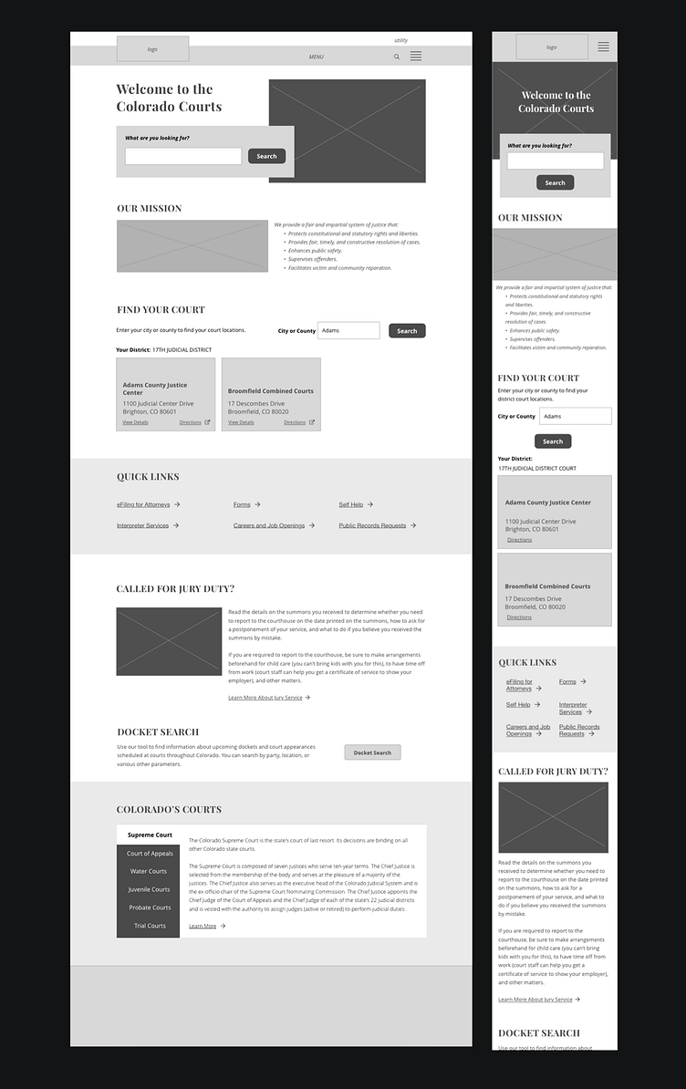
Mobile-friendly Homepage
Significant user research, business stakeholder interviews, and other tasks preceded the creation of this low-fi homepage design for a state judicial system website. My focus was on understanding high priority features and pages that site visitors come to their state judicial website to find. I also wanted to find creative yet intuitive ways to present content to users, to encourage engagement within the site, and to make links and other interactions accessible and clear. A department whose services are highly location or region-based, this site gave us the opportunity to 'do the work' for the user, helping them to more quickly reach content and information relevant to their city or county, rather than requiring as much browsing and self-service by the user. This design balances white space and minimalism with high-contrast elements in an inviting way. (Done as part of paid project with GovWebworks.)
