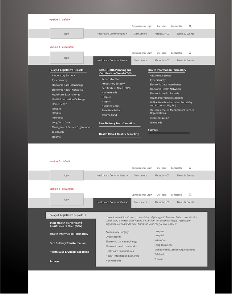
Three-level Main Menu
This reflects two versions of a main menu design where each is shown in its default / closed state and then with the menu open. In each case, the business goal was to expose three levels of the site's hierarchy in the menu. Additionally, analysis showed difficulty for users in understanding what could be found at each menu option, hence the descriptive text shown in concept 2 - this would be used to provide contextual information to the interacting user, helping them know what can be found in each second-level menu item (Policy & Legislative Reports). (Done as part of contracted work for GovWebworks.)
More by Sarah Crossman View profile
Like
