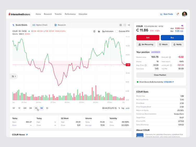
Interactive Brokers platform UX/UI concept
This is especially true for online broker platforms, where the quality of the UI can have a significant impact on user engagement and business success.
We decided to create UI concept of world-famous broker platform Interactive brokers, with the goal of making it more clean and user-friendly.
One of the main goals of the redesign was to simplify the user experience. We wanted to make it easier for users to navigate, find the information, and take the actions they want. To achieve this, we focused on reducing clutter and making the interface more intuitive. We also paid close attention to color, and other design elements to create a cohesive and visually pleasing experience.
Overall, we believe that the redesigned UI of Interactive brokers platform is a significant improvement over the previous version. It is more clean, user-friendly, and accessible, and we believe that it will help our users achieve their financial goals with greater ease and satisfaction.

