VR Experimental User Interface Design
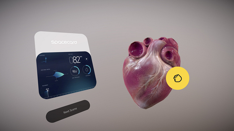
There are several input modalities we explored in spatial interface design. The most critical interface components were microinteractions with buttons and anchors. Creating buttons that visually represented simplicity yet delighted the user with deep, life-like behavior when engaged was important in setting expectations with the user.
Likewise allowing virtual UI components to overlay on top of 3D objects was a great advantage in VR environments.. Anchors provided additional functionality for more precise manipulation that was not available in real-world interactions with physical objects.
Virtual reality products are all about 3 dimensions, and the user interface is no longer restricted to a flat rectangular screen or surface. We thought about how the design is in the real world and apply it to the virtual world while considering design elements such as sightlines.
How do you organize the key components in any interface when the canvas size is unlimited? We can utilize some key physiological rules corresponding to directional gazing as anchors in creating interfaces that are both natural and functional.
Forward Gazing and Room Based Organization When coupling interfaces and virtual environments, we can personify information architecture as rooms. Sections can be laid out in front of the user as doors to move forward through. The deeper the forward, or Z movement is, the further down the user moves through the information architecture tree.
Backwards Gazing and Breadcrumbs Likewise, turning back to see where you’ve come from is a useful physiological anchor that can be tied to the breadcrumb modality, or going back. Creating a simple link between forward and backward movement in Z with movement along the information architecture tree can be quite useful.
Upwards Gazing and Abstraction There are useful positions within the virtual environment that may be outside the immediate line of sight. These include spaces above and below the user. Research argues that upwards deviations of the eyes activates creative activity in the brain encouraging us to reach nearby time and space into the infinite and eternal. This physiological hardwiring can be anchored to menu systems that require movement into unrelated or abstracted information that is not directly corresponding to what is currently in front of the user.
Downwards Gazing and Organization Gazing downward is a clear psychological anchor related to organizing assets we currently have. Animals often bury valuable items in the ground, humans organize files on a desk and we usually keep valuables in our pockets. All of these physiological anchors can be used as anchors to the interface design. When it comes to storage, asset accumulation and archiving it makes the most sense to utilize Z space below the user for this exact purpose.


