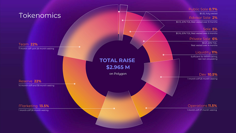
Charts ain't boring: Tokenomics for the Web3 startup
Pie charts can often be dull and confusing, can't they?
As a state-of-the-art Web3 startup, it's crucial to communicate your tokenomics in a captivating manner that holds your investors' attention. That's where the innovative and aesthetically pleasing glassmorphic style comes in handy!
The art and science of data visualization
Here are the data viz tricks. Let's compare:
Occasionally, it may be necessary to arrange the sections in order, starting with the largest slice. However, in this case, it's best to avoid drawing excessive attention to the fact that the team receives a significant portion.
The one above isn't quite ideal either, is it? This tiny "Public Sale" piece looks too sharp and irritating.
Designed with Adobe Illustrator and MS PowerPoint to keep it editable for the client ⚡️
What do you think?
Press "L" if you like it and share your thoughts in the comments!
We provide ongoing visual communications support for overwhelmed CMOs and CEOs in tech and finance:
Data visualization (charts, tables, infographics illustrations).
Presentation design (investor pitches, corporate executive presentations, templating, and more).
Creative consulting and art direction.
Want to collaborate?
🌏 Visit: przntperfect.com
🤩 Behance: Prznt Perfect
Get free project estimation and consultation:
📩 E-mail: hello@przntperfect.com
👨🏻💻 Discovery call: Book a 30 mins call


