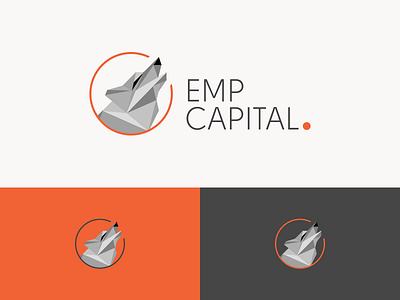
Wolf Polygon Logo
Here is the final design the client went with.
The logo is for a financial training company. The design uses a howling wolf to intentionally bring strength, courage and confidence to the user. The mark is placed within a circle that creates the subtle shape of a letter "C" to draw reference to the word Capital.
We created the polygon wolf, to separate it from a traditional mark and bring a fresh, modern approach to the brand.
Overall the client was peeing their pants and now to move onto other assets.
More by QhueCreative View profile
Like

