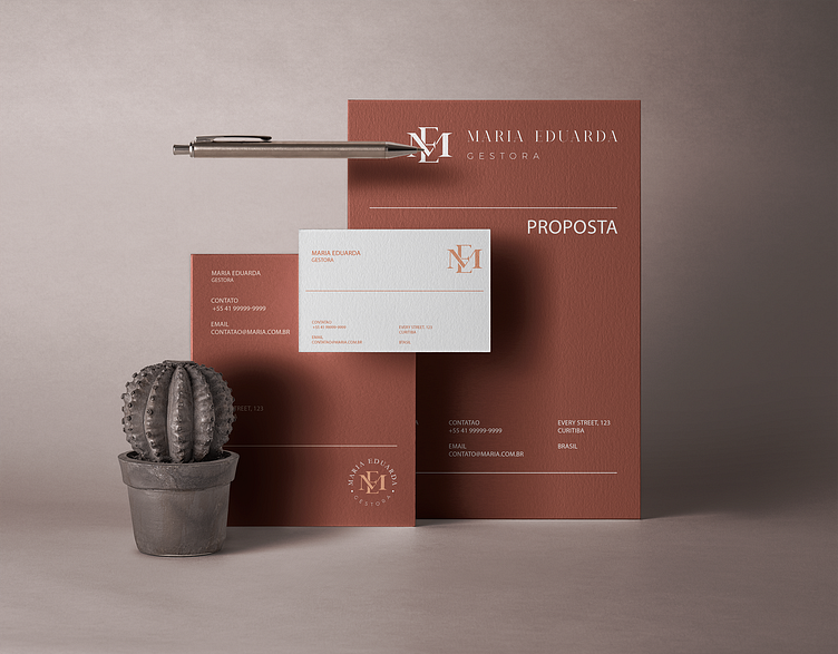
Maria Eduarda - Brand Identity
Maria Eduarda is a business manager who acts ahead of business management, companies and projects.
For the creation of the visual identity a serif typography was chosen to transmit seriousness, and for the creation of the symbol were used the initials of her name, the junction of the M + E with the letters of the typography itself. As well as the typography, the colors were also chosen to give seriousness to the project, using salmon tones. Thus, its visual identity was designed to transmit credibility and sophistication.
More by Beto Biscotto • Biscotto Studio & CO. View profile
Like
