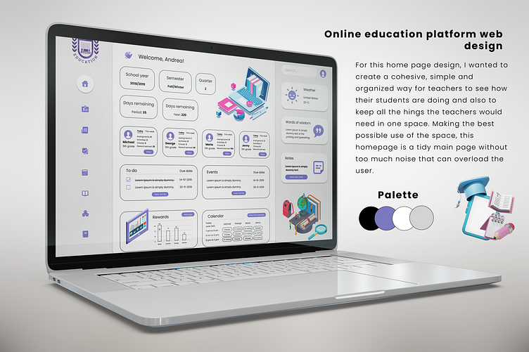
Online education platform home page web design
Many times learning is tedious and that makes students lose interest and they don't get good grades. I wanted to make a UI that would defy that, with a beautiful interface and order for both the teacher and the student so that they both feel motivated to go in and do the courses that interest them.
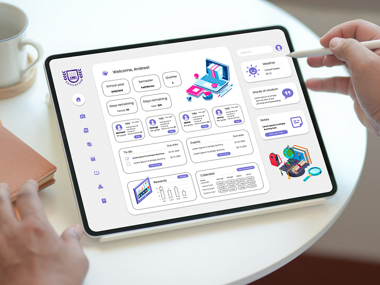
The idea is that the teacher has live online courses, that he assigns assignments like in schools, and can have the grades of his students in one place with real statistics. 📊
The e-learning page courses now are made for people to follow at their own pace, but the problem is the lack of community generated and if the student has questions, the course teacher cannot reply to them directly.
This platform solves that problem since it has a way that the student can ask the teacher what they want. The teacher pays due attention to all his students by evaluating the statistics of his students on the home page.📈
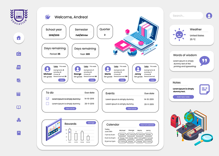
So for this home page design, I wanted to create a cohesive, simple, and organized way for teachers to see how their students are doing and also to keep all the things the teachers would need in one space, making the best possible use of the space.
It has its minimalist touch, it looks neat and clean but without losing that practicality and delicacy. I use light colors and pastels to give it the kind of vibe mentioned above, plus the color purple also signifies knowledge and order, which is what good learning (in this case, e-learning) looks for.📖📚
