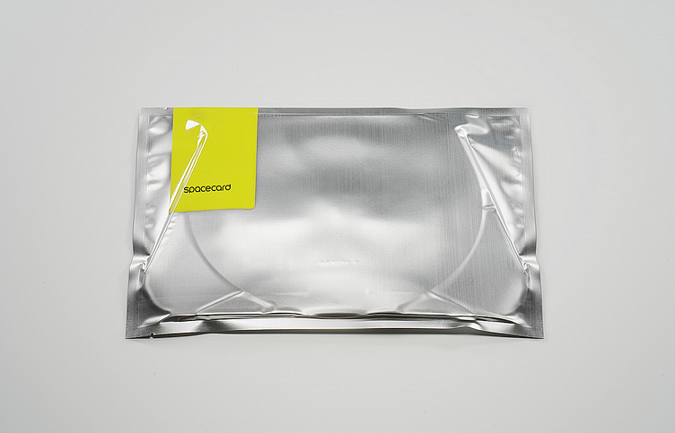
SpaceCard Branding & Popup 'Unboxing' Experience Design
SpaceCard was a name derived from the fundamental concept of the product - a postcard for interactive spaces. We used this name in combination with an aesthetic and visual style seen in NASA space programs with the use of black, yellow and silver to denote a futurist aspiration as if the product was out of space!
SpaceCard® is a mobile technology and popup VR system that delivers an ‘Instagram-like’ experience for exploring and jumping into VR spaces using your smartphone. Unlike other systems, SpaceCard® uses the smartphone camera and machine-vision technology to track the users’ hands. This allows users to interact in drag-n-drop environments, perform walkthroughs and configure shared spaces in real time.
This is the opening and unboxing experience of the product itself. The goal of this experience is to minimize required steps, friction and setup processes to start a VR session. Smartphone VR systems typically have an assembly phase where the user is required to set up and ‘build’ the enclosure in a DIY fashion.
Our aspiration with the UX was to completely outdo any other VR system when it comes to time to VR. We measure the effectiveness of this experience by the amount of steps required for the user to have the visor on in the VR state starting from the collapsed envelope state.
We devised a system to require only 3 steps to full assembly from when the product is in its collapse state to its expanded visor state. This helped set the expectation for the rest of the user experience.


