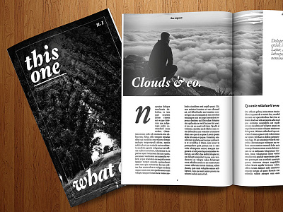
Magazine Layout Design - Cover & Inside
A design I made a few months ago, trying to do something minimal and elegant, but also with a classic feeling.
There is a lot of text space 'cause I don't love those mockups, with only a few words per page, they feel so unrealistic.
See the attachments for details.
Magazine mockup from GraphicsFuel.com :D
More by Francesco Puppo View profile
Like


