Homepage design for Payoneer platform | Lazarev.
Greetings, Dribbble! 👋
We're thrilled to kick off a brand new series of design shots dedicated to the major uplift of a leading Fintech platform 💸 Our talented UI/UX designers have been hard at work crafting a stunning redesign app concept for Payoneer. So, let's buckle up and embark on this exciting journey together.
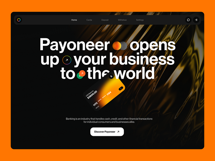
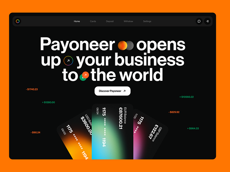
Let's begin with the face of the platform. Our team has meticulously designed a homepage with a fresh, bold approach that incorporates gradients, interesting textures, bright color accents, and unconventional forms.
But, of course, the look is not everything 💃 Even when working on a design concept, we prioritize the business aspect of it all. In this case, a visually stunning homepage design will immediately capture customers’ attention and retain them. This, in turn, drives user exploration and conversion to paying customers.
In this shot, we present two distinct options of the homepage redesign. Which one speaks to you — share in the comments! And, stay tuned for upcoming shots, as we have so much more to showcase when it comes to FinTech app design.
If you're looking to empower your app, we're here to help! Let's connect and discuss how we can elevate your FinTech UI design as well as user experience
📩 Shoot us an email at hello@lazarev.agency