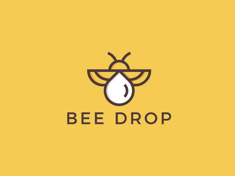
Bee Drop Logo Design
The Bee Drop Logo Design dribble shot showcases a beautifully crafted logo that captures the essence of nature and sustainability.
The logo features a drop of honey that has been shaped into the form of a bee, with intricate details that highlight the beauty and importance of these pollinators.
The design is minimalist yet impactful, with a simple color palette of yellow and black that adds to the logo's overall sophistication. The font used in the logo is also simple and clean, making the bee drop the focal point of the design.
The Bee Drop Logo Design is a perfect example of how a logo can communicate a brand's message and values effectively. The honey drop represents nature and sustainability, while the bee symbolizes pollination and the importance of the environment in our lives.
This logo is ideal for businesses that value sustainability and eco-friendliness, such as organic food companies, farmers' markets, and natural beauty brands. Overall, the Bee Drop Logo Design is a beautiful and timeless design that will undoubtedly stand the test of time.
-----
Do you have a project to discuss?

