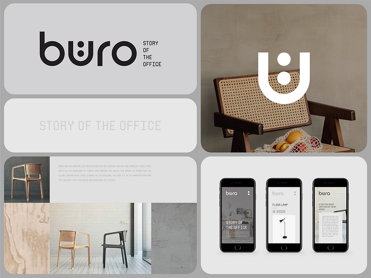
Buro / Architect, Interior Design Branding
Please share your thoughts💭 in the comments and press like❤️ to support our hard work.
Buro is one of our favorite logos. How do you think it happened🤔?
Everyone has their guesses about the reason it is one of our favorite logos🤭. First of all, it is because of its simplicity, and secondly, it is because of the highlighted “u."💁🏻♂️ It is an upgraded letter from the Turkish alphabet. We designed it in this manner to make it more appealing👀 and memorable to curious viewers who wonder why it is this way.
Let's work together!
— Do you have a project? 📩 projects@markaworks.com
— Visit our website to see all the project presentations.
More by Marka Works Branding Agency View profile
Services by Mustafa Akülker
Like
