Analytics UI - Insight card
Hey there 👋
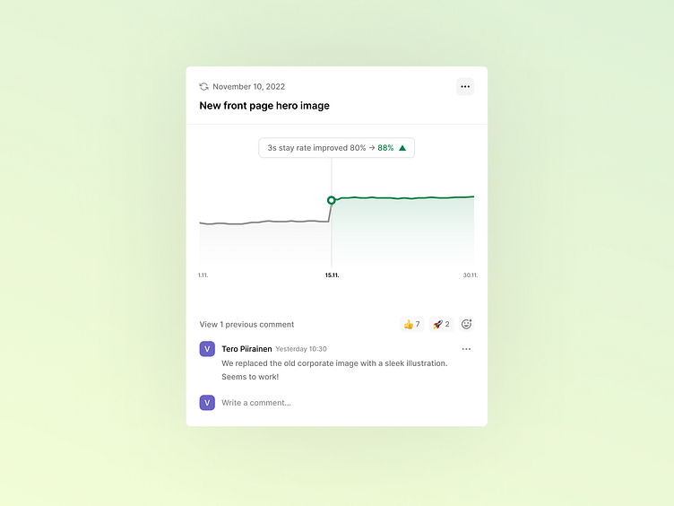
This shot is a design for an insight card from the Volument UI. Volument introduces a few unique metrics to understand website visitor behavior, and one is the three-second stay rate.
In this example (UI shot), the user changed hero image on their website. Volument collects data and shows the results - after the site update 88% of all visitors stay on the page for more than three seconds. This is a strong indicator of a positive first impression.
Get early access to insight-led web analytics: https://volument.com/
What is Volument?
The way we interact with websites has changed a lot, but web analytics is stuck in the past. Some analytics tools give you an absurd amount of graphs, metrics, and numbers, but you still have to do the guesswork and interpret what it all means.
First, we need to think about the users. The core audience of web analytics tools is people who aren’t always data savvy. Marketers, designers, developers, and startup founders need a simple, easy-to-use tool that respects their time and attention and makes their life easier.
Second, web analytics tools should do the heavy lifting for the user, not the other way around. Users shouldn’t have to figure out what to do. So give them insights, something they can actually use.
Third, we need a long-term solution to collect and process website data in a way that doesn't destroy user privacy or website UX. The discussions around privacy regulations are too complex; everyone has interests and agendas. Forget loopholes and do the right thing.
Volument is insight-led web analytics. It analyses your website traffic and visitor behavior and generates actionable insights automatically. We tell you in simple language what works and what needs improvement.
