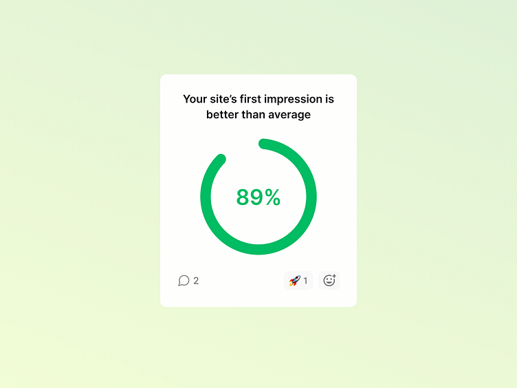
Analytics UI - Doughnuts
Hey there 👋
This shot is a design for an insight card from the Volument UI. We're reimagining how marketers, website owners, designers, and founders interact with website data.
Replace Google Analytics (and other bad analytics experiences) with simple, automated insights: https://volument.com/
What is Volument?
The way we interact with websites has changed a lot, but web analytics is stuck in the past. Some analytics tools give you an absurd amount of graphs, metrics, and numbers, but you still have to do the guesswork and interpret what it all means.
First, we need to think about the users. The core audience of web analytics tools is people who aren’t always data savvy. Marketers, designers, developers, and startup founders need a simple, easy-to-use tool that respects their time and attention and makes their life easier.
Second, web analytics tools should do the heavy lifting for the user, not the other way around. Users shouldn’t have to figure out what to do. So give them insights, something they can actually use.
Third, we need a long-term solution to collect and process website data in a way that doesn't destroy user privacy or website UX. The discussions around privacy regulations are too complex; everyone has interests and agendas. Forget loopholes and do the right thing.
Volument is insight-led web analytics. It analyses your website traffic and visitor behavior and generates actionable insights automatically. We tell you in simple language what works and what needs improvement.
