Homes Redesign
Redesign concept for Homes.com
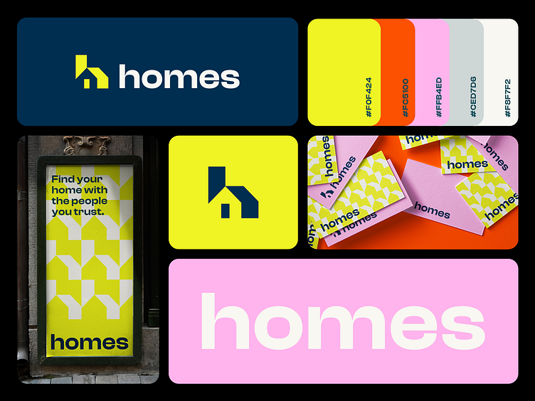
I believe that the current Homes.com logo is outdated and no longer represents the modern and innovative approach of the brand. As a brand visual identity designer, I propose a new brand visual identity design, a new logo that better reflects the company's values, personality, and mission.
The new logo is designed with simplicity and creativity in mind. The primary icon is a stylized combination of the letter "h" and a roof. This design choice is both relevant and memorable, as it conveys the essence of homes and the real estate industry.
The color palette for the new logo is vibrant and fun, with bold hues that will capture the attention of potential customers. The colors used in the logo are also carefully selected to convey the brand's personality and values. The overall look and feel of the logo is youthful and modern, making it an ideal fit for a company that is committed to delivering innovative and exciting solutions for home buyers and sellers.
Overall, the new Homes.com logo is an ideal representation of the company's values, personality, and mission. It is a bold and edgy design that reflects the brand's commitment to providing top-notch services to its customers.
Looking for a creative partner for your next big idea?
If you think I can help you get in touch


