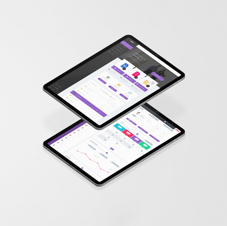
DealTap v2.0 Dashboard UX/UI Mockup
Setting the visual language for the product interface started with identifying the brand and letting all aspects of the product reflect the positioning of DealTap. The goal of the visual language was to start mobile-first while enabling larger proportions of critical UI to maximum space on the screen and eliminate as many non-critical components as possible.
Administrators would often be using workstations as well - so the logical solution was to focus on a responsive web application that removed the friction of downloaded software and enable all devices to participate with an internet connection.
More by Milan Baić View profile
Like

