Editor's Page- Fitness application
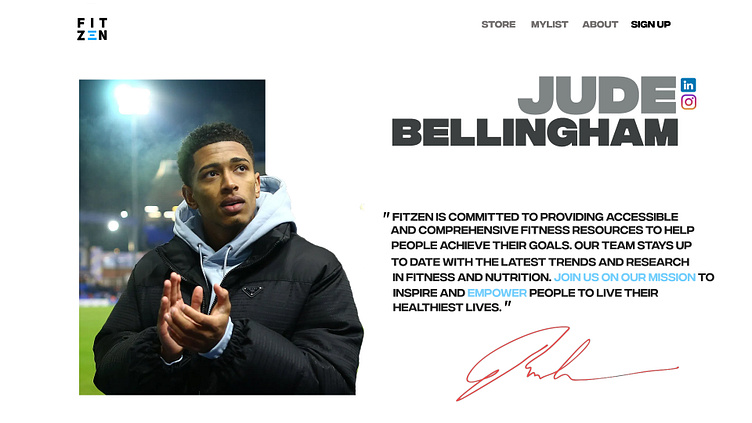
This was a mockup for a website we made. I sticked with the theme to use block letters which gives it a heavy feel to the site. This also increases the attention from the user directly to the name if the editor. Used shades of black through out the site to be consistent.
More by Hammaad Rizwan View profile
Like
