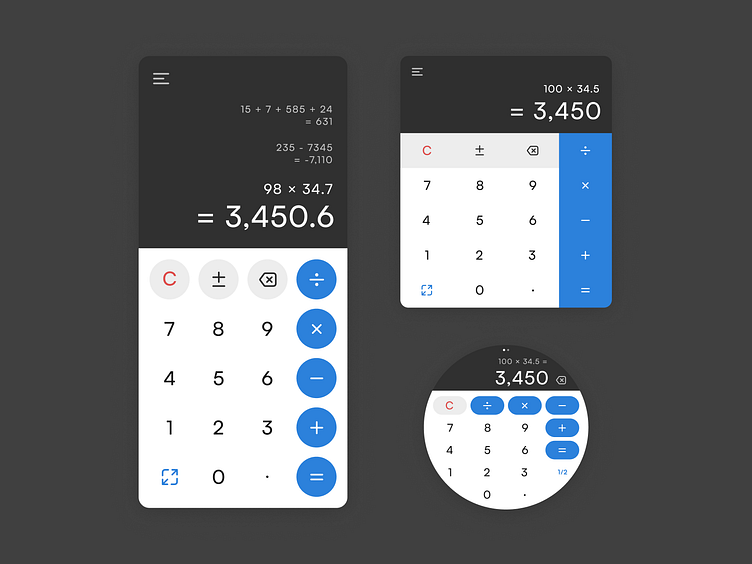
Daily UI #004 — Calculator
A mini UI case study
For this one, I saw an opportunity to have a serious exercise in design systems. Even though I settled on designing only one screen, I did it for mobile, desktop, and smartwatch, so the components made even more sense for this exercise. Atomic design FTW!
Research
The calculators that I use daily were a great inspiration. Each comes from a different design system which was very interesting to study and compare - Android, Windows 10, MacOS, and Tizen. Plus, I looked at some other calculator apps out there.
Having collected that research, I synthesized what I had found out and decided on a button layout and most useful features - toggling between more or less mathematical functions, history, and additional types of calculators.
Process
I started working on the desktop app and making that initial design responsive and building up to a template component allowed me to easily create and customize the other two.
In this case, the button is a set of color and text/icon variations that I am using as an atom component, which I then used to create a row to act as a molecule component. I decided to duplicate my atoms for the app, howver, since I wanted to make the button’s contents significantly bigger without affecting the rest of the designs.
Functionality
The mobile and desktop apps have an “expand” icon which would show more options. Additional calculators (e.g. scientific, currency, length, etc.) can be found within the menu.
The watch app, on the other hand, is more stripped down. Tapping the “1/2” button toggles between two sets of mathematic functions. The pagination indicates there is a second page, on which the user can find the settings and a list of additional kinds of calculators. Tapping one would switch back to the first page and open it there.
Lastly, I think the MacOS blur effect is gorgeous, so I had to recreate it.
Any feedback is most welcome! Let me know what you think (:


