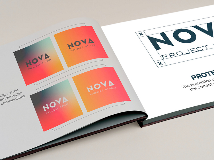
Nova Project Studio Branding
We worked with Nova Project Studio, a new boutique project management firm that targets high-net-worth individuals. They came to us in need of a brand that would reflect their eye for detail.
We delve into the meaning behind the name “Nova”, which stems from “supernova”, the astronomical event that occurs during the last evolutionary stages of a massive star. This metaphor of sudden explosive change followed by calm perfectly encapsulated the services that Nova Project Studio provides to their clients.
The Redesign
To visually represent a supernova, we used the delta symbol from the Greek alphabet as the “A” in the logo. The uppercase delta (Δ) symbolizes change, which aligns with the nature of the firm.
The color scheme follows astronomic themes, taking inspiration from the vastness of space. They were chosen to evoke feelings of awe, inspiration & trust.


