UI Redesign - EdTech Website
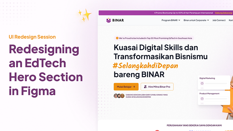
✨This week, I attempted to do a quick hero section redesign to BINAR website. The aim is to improve the visual hierarchy of the hero section. I also documented my process in a time-lapse video that you can watch on my YouTube.
This was a fun and challenging process at the same time especially working on
the brand colors that a bit challenging to combine, orange and purple.
I try to do this session in under an hour and definitely will try to consistently do this redesign to exercise my problem solving and design skills.
Disclaimer: Logo and copy of the site belongs to their respective owner.
More by Ade Purnama View profile
Like


