noKIA - Logo redesign how-to

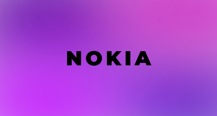
Start
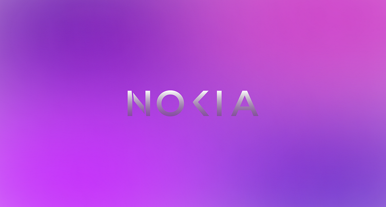
I started with an aurora background, and the next NOKIA, with the font montserrat.
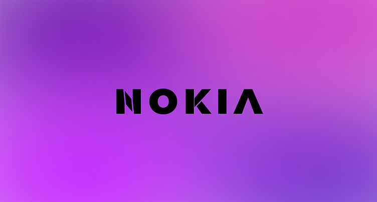
Cutting out shapes
I then started to cut out shapes of the text.
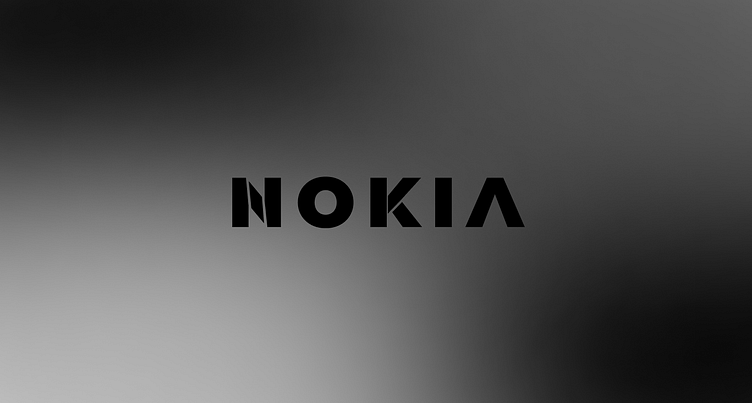
Black and white
I tried turned the aurora background into a black aurora, it's kind of cool.
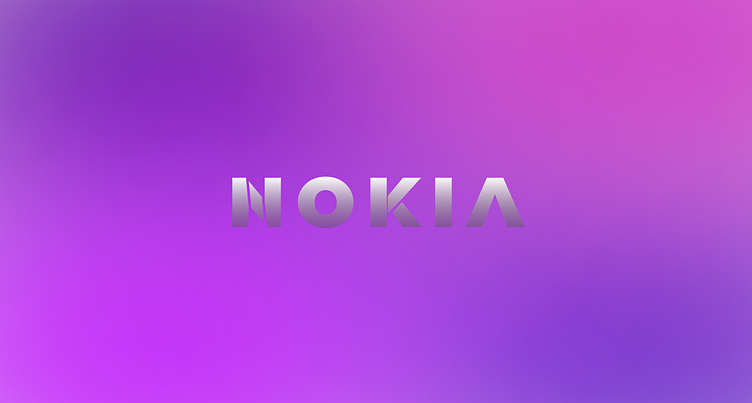
Finishing up No. 1
For the first logo, I changed the color of the text to a linear gradient, going from white to a slightly transparent grey.
Thinning the text
I decided the text was a bit to thick, so I thinned that down a bit. I also removed the line in the K.
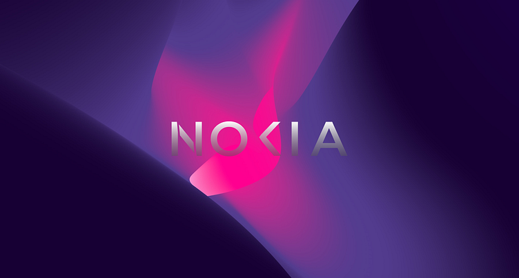
Adding a background image
I then added a background image from unsplash.
I did a few more things with the black aurora that I won't cover here, that is in the Figma design, if you want to see it.
See the full Figma design here:
